
Seventh > Sections > Features viewer
Features viewer
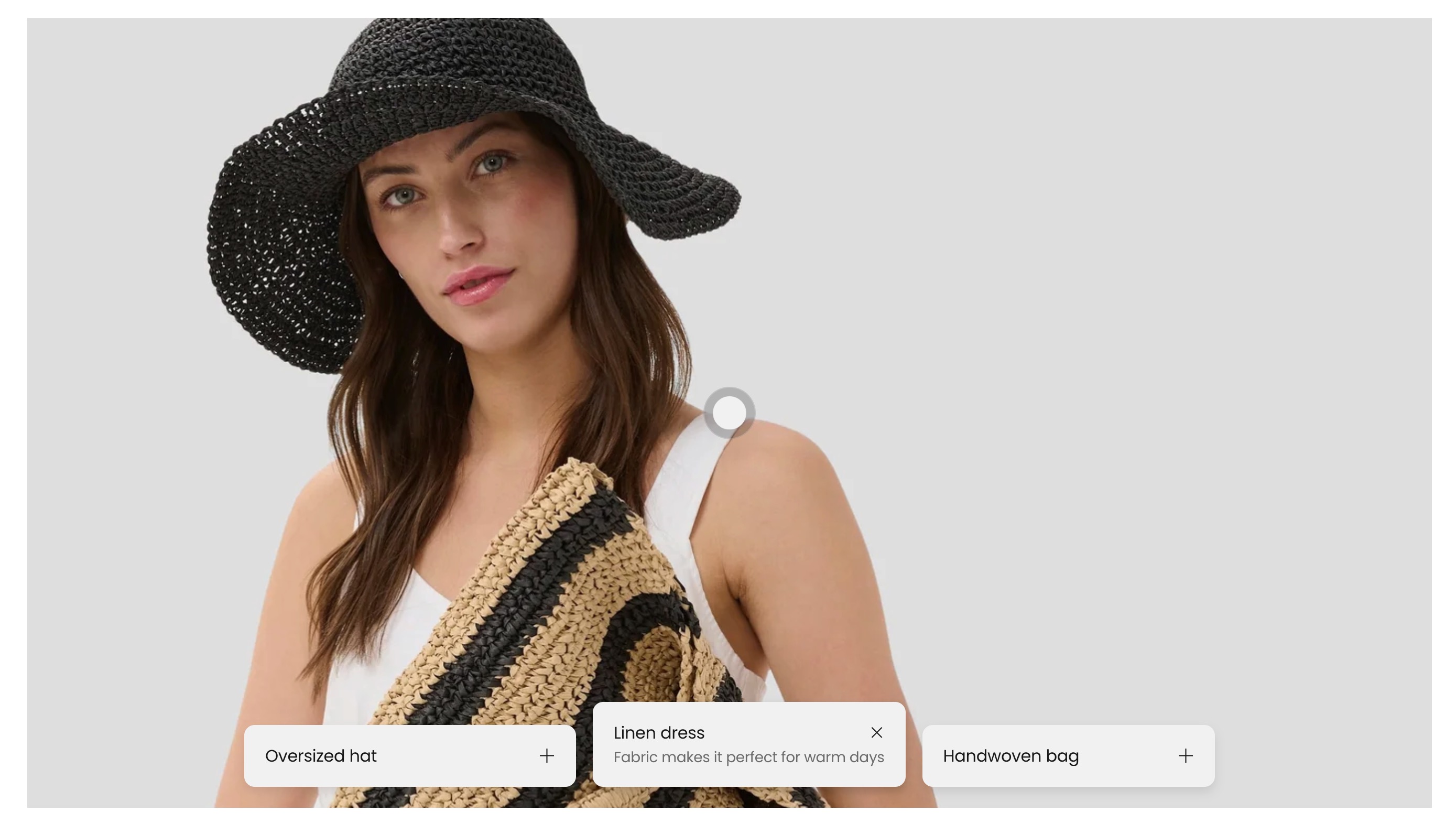
The Features viewer section creates an interactive media experience with tabs. You can use image tabs or zoom tabs to guide customers through product details, materials, and highlights.
What it does
This section displays:
- A features viewer card with a desktop and optional mobile background image
- Interactive tabs that switch panel content
- Two tab block types: media tab and zoom tab
- Optional section header with sticky behavior
Section settings explained
Desktop height
- Controls the aspect ratio used for the viewer on desktop.
Mobile height
- Controls the aspect ratio used for the viewer on mobile.
Section header position
- Places the header at the top or on the left.
Stick to top
- Keeps the section header visible while scrolling.
Section design options
- Uses standard section design settings (color scheme, top/bottom padding, section width, optional background media, overlay, parallax, push content down, full-height).
Features viewer card settings
The section contains one static Features viewer card block
Background media
- Desktop image for the main viewer.
- Mobile image for small screens.
- If no image is set, a placeholder is shown in editor/storefront.
Card style
- Media overlay: color overlay on the card media.
- Padding: internal card spacing.
- Add padding to media: toggles media inset spacing.
- Border radius: card corner rounding.
- Color scheme: card color scheme.
Tab blocks inside the card
Media tab
Use this tab when each tab should have its own image panel.
Panel media
- Desktop image
- Mobile image
- If missing, a placeholder image is shown for that tab.
Tab content
- Title
- Description (rich text)
- Optional icon or image indicator via icon settings
Zoom tab
Use this tab to place focus points over the shared card background image.
Position controls
- Desktop horizontal position
- Desktop vertical position
- Mobile horizontal position
- Mobile vertical position
Tab content
- Title
- Description (rich text)
- Optional icon or image indicator via icon settings
Tips for success
- Use media tabs when each feature needs its own image.
- Use zoom tabs when all features should reference one main image with different focal points.
- Keep tab titles short so tab rows stay readable on mobile.
- Choose desktop/mobile height combinations that preserve important image content.
Common use cases
- Explain product construction using zoom markers on one hero image.
- Compare feature variations with separate media tabs.
- Tell a step-by-step product story with tab titles and short descriptions.