
Local > Product card
Product thumbnail
You can start by choosing a media aspect ratio upon all of your product thumbnails will be resized.
The available options for Media Aspect Ratio are:
- Short (4:3) – Ideal for images that are slightly wider than tall.
- Square (1:1) – Perfect for square images, offering a uniform appearance.
- Tall (5:6) – Suitable for images that are taller than wide.
- Taller (2:3) – An option for even taller images.
Choose whatever suits better for your products in order to reduce the amount of cropping you get.
We also have a Natural option which will make sure that the thumbnail will not crop, but show at it's normal aspect ratio.
There isn't any specific resolution, just make sure that you test various combinations of these options to see which one fits better to your product photos.
Fit media inside container works when you set a fixed aspect ratio and want all the images to be resized (but not cropped!) to fit inside that specific area. This works very well with very tall images or if your product photos are not resized in the same way.
The Container Inner Spacing setting controls the amount of space between the content inside the product container and its edges. This option helps to ensure that your product images are not too close to the edges, giving your layout a more balanced and visually appealing look.
Note: This setting will only apply if the media is set to fit inside the container.
The Show Second Product Media on Hover option allows you to display the second product image when the user hovers over the first one.
The Fallback Image option allows you to upload a custom image that will be displayed when a product does not have any images assigned, ensuring a consistent appearance in your product grid even for products without images.
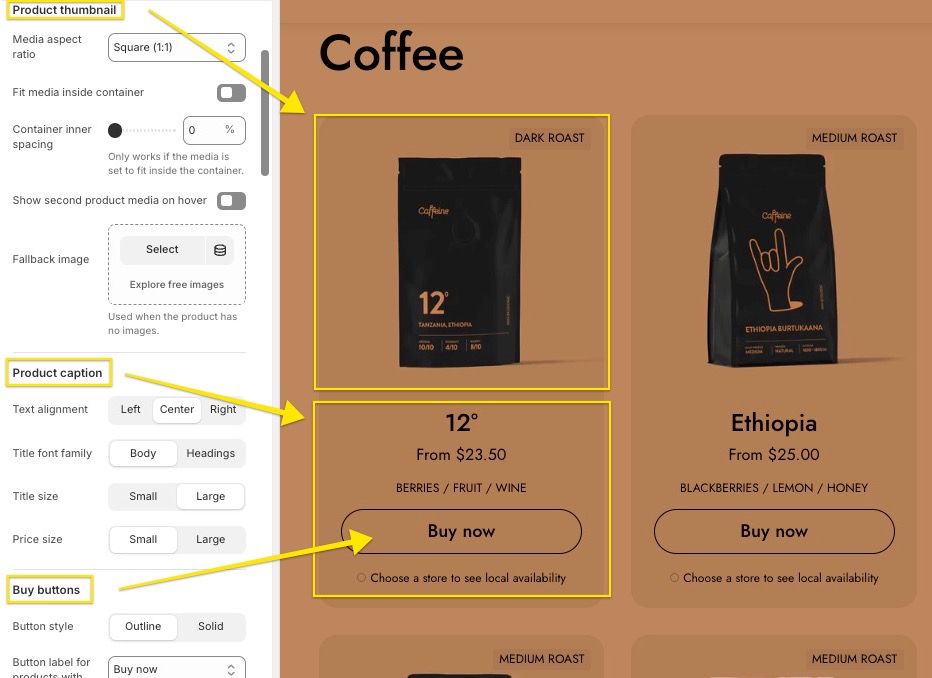
Product caption
The Product Caption section offers several customization options to tailor how the product information appears in your product grid. You have a few options for text alignment, title font family, title&price size.
- Text Alignment: Determines how the product caption text is aligned. Options include:
- Left: Aligns the text to the left.
- Center: Centers the text.
- Right: Aligns the text to the right.
- Title Font Family: Defines the font style used for the product title. Options include:
- Body: Uses the same font as the body text.
- Headings: Uses a font specifically designed for headings.
- Title Size: Controls the font size of the product title. Options include:
- Small: A smaller font size for the title.
- Large: A larger font size for more prominence.
- Price Size: Adjusts the font size of the product price. Options include:
- Small: A smaller font size for the price.
- Large: A larger font size to make the price more noticeable.
Buy Buttons
The Buy Buttons section offers several customization options for the appearance and functionality of the product purchase button.
- Button Style: You can choose between two button styles:
- Outline: The button has a bordered outline with a transparent background.
- Solid: The button has a solid background color, making it more prominent.
- Button Label for Products with Options: Determines the label displayed for products with options. Available choices are Buy now or Choose options.
- Align Buy Button to the Bottom of the Card: This option places the buy button at the bottom of the product card, which works best if the quick buy option is the last block in the card.
One note about the buy button position, in Local the products grid are flexible and all the content inside the card is aligned from top to bottom. However, if you have variable content (like longer titles, custom icons or text), you can stick the buy buttons at the bottom of the product card, in order to have the all aligned in the same way.
- Hide Quick Buy Button When Product is Out of Stock: When enabled, this option hides the quick buy button if the product is out of stock.
- Always Open Quick Buy Modal: By default, the quick buy modal only opens for products with multiple variants. This option forces the quick buy modal to always open, regardless of the number of variants.
Custom card design
For product card design, several customization options are available:
- Background, Text, Buttons, Border, and Shadow: Colors can be chosen for each element.
- Hide Border: A separate option to hide the card's border.
- Hide Shadow: A separate option to hide the card's shadow.
Product Rating
To display ratings, a product rating app must be added. Learn more.
Rating app: Our theme supports 8 different product rating/review applications, which can be selected here. For further guidance, refer to the Recommended product reviews apps article in our documentation.
Please note that third-party apps may require additional steps for proper integration.
Product badges
For discounted products, three display options are available for the discount badge:
- Percentage
- Text
- Amount Saved
To display the discount badge, ensure the product is on sale by setting a compare-at price higher than the actual price in the Shopify admin product page.
Additionally, but you can also configure 3 different custom badges that you can set to appear based on different product tags.
Both automatic and custom badges allow for customization of the background color and text color.

The theme includes a maximum of 3 custom badges that can be added - the limit is for design reasons. If you want to add more you would need to edit the product-badges.liquid file.
Please follow these steps to modify the product-badges.liquid file in your theme's code:
- Access the Theme Code Editor, here: https://share.zight.com/E0ue1Aw0
- In the left sidebar, scroll down to find the
Snippetsdirectory. - Click on
Snippetsto expand it and locate theproduct-badges.liquidfile. - Click on
product-badges.liquidto open it in the editor. - Add the code for the new badge, here: https://share.zight.com/Wnu8gxO6
Please use the following code:
  {%- if product.tags contains 'new' -%}
<span class="product-item__badge product-item__badge--{{ settings.product_card_badge_custom_3_text | handleize }}"
style="background-color: {{ settings.product_card_badge_custom_3_color }}; color: {{ settings.product_card_badge_custom_3_text_color }}"
>
new
</span>
{%- endif -%}
In this example, replace "new" with the tag you've assigned to your product.
Please note that any changes made directly to the theme code not be preserved after future updates. It is recommended to keep track of any modifications so they can be reapplied after each theme update.
Dynamic icons list
Local has this unique feature where you can showcase different product features with icons, based on metafields.

Each product can hold up to six different icons like these and you can add them in two ways. First, as you can see in the Theme Settings, for each icon you need to set two metafields - one for the icon, one for the label. In this area of the customizer you are basically connecting product data to the proper icon.
If you don't have experience with metafields, you might want to read this article from Shopify documentation: https://help.shopify.com/en/manual/metafields/metafield-definitions
Step 1
You need to create the metafield definitions in the metafields area of your store. So go to Settings > Metafields and Metaobjects > Products and create two definitions for each icon, one for product icon (example), one for product label (example). Then, after metafields are created, you have to populate the theme settings area with the namespace and key from each metafield you've created: https://share.zight.com/6qunOG99.
Please note that icon metafileds should be set as IMAGES, while label metafields should be set as SINGLE LINE TEXT.
Look at the following graphic on how should these work side-by-side:

Step 2
The metafields will now appear in your individual product pages as well, so when you add values for certain products, these will appear in the product cards.

Pro tip
Because it can be time consuming to add the same icons & labels all over again, we've also come up with a way to simplify this process and only work with LABEL Metafields. For this to work, you need to upload your specific ions in the Files area of your store, and make sure the filenames correspond to the labels that you will use (in a handle form).
Example: You have a label called Gluten Free. If you upload a file named gluten-free.png, that icon will be used for this label without you needing to upload a separate icon in the icon field (https://share.getcloudapp.com/jkuOE8m2). Our theme will always pick the uploaded icon first, then if this fails, it will search for a png file named as the label.
Display Icons in Filter Using Metaobjects
Additionally, the theme allows you to display icons in Filter using metaobjects. This method involves creating a metaobject definition in Settings > Custom data > Metaobject definitions > Add definition. When creating the metaobject, you will need to define two fields: one for the image and one for the label (refer to the screenshot with settings in our demo theme).
Next, you’ll need to create a metafield for the metaobject in Settings > Custom data > Metafields, here: example. It is important to note that the metafield must be of the metaobject type that you have created previously.
Afterward, populate the data for the metaobject in Shopify Admin > Content > Metaobject, here: example.
Finally, on the product page, select the appropriate option for your product’s metafield (see the screenshot in the demo). This will allow you to link the icons and labels for each product accordingly.
Once everything is set up, the filters should appear in the Search & Discovery app: https://share.zight.com/E0uBd7qN.
For more details about metaobjects, please refer to Shopify's documentation on Metaobjects.
We've prepared a list of 289 icons that you can download and use in our theme!
You can access it here: https://resources.krownthemes.com/local/