Local > Product page blocks
The product page is the most important page on your store, where the actual purchases happen, so you need to carefully set this up in order to make sure that it converts in the best possible. Our theme has all the tools you need to achieve this, so let's get started.
Product page blocks
When you first edit the product page you will see some settings related to gallery style on desktop (scroll vs slider) and pagination design (scrolling gallery doesn't have pagination so this only applies to slider).
After setting up the gallery, you can change the content of the product page using blocks, so you can really achieve a lot of things with different products, page templates, metafields and more.
Nutritional information
The nutritional information block is a more special one, which converts the inserted content into a well formatted table that can be used for multiple purposes.
To maintain the "nutritional info" format you have to use Rich Text content type for the metafields you create.
The general rules are:
- Separate label and value with a comma (only the first comma in a row will be counted)
- Use line breaks to add a new row (line breaks can be added with SHIFT + ENTER)
- Use a hyphen ( _ ) to indent rows.
- You can have more than one table if you use different paragraphs (ENTER without SHIFT)
- You can use some text styling, such as bold, italic, or underline, or even links.
- Don't use HEADINGS !! As these are not properly styled
Here are some examples that you can copy & paste to start editing with your own information:
SIMPLE NUTRION FACTS
Energy, 205 kJ / 49 kcal
Fat, 0g
- of which: Saturates, 0g
Carbohydrate, 10g
- of which: Sugars, 7g
COMPLEX NUTRITION FACTS
Energy 8g, 10%


Total Fat 8g, 10%
- Saturated Fat 1g, 5%
- Trans Fat 0g


Cholesterol 0mg, 0%
Total Carbohydrate 37g, 13%
- Dietary Fiber 4g, 14%
- Sugars 10g


Potasium 160mg, 7%
Protein 3g
Vitamin D 2mcg, 10%
Calcium 260mg, 20%
Iron 8mg, 45%
Potassium 240mg, 6%

* The % Daily Value tells you how much a nutrient a serving of food contributes to a daily diet.
PRODUCT DETAILS / INGREDIENTS
Producer, Gentle Folk
Region, Adelaide Hills
Alcohol, 11.5%
Style, Untamed and fun
Vintage, 2022
Size, 750ml
Closure, Cork
Varieties, Pinot Gris, Semillon, Muscat, Merlot, and Chardonnay
Classifications, Organic Principals and VeganWinemaking Style, Progressive
Progress chart
Progress charts can be used to showcase various details of a product based on a certain scale. Of course each product will have different information, so you can use dynamic data to allow unique values for each product. For this purpose you have to create a custom integer metafield to match the settings of your progress data. Make sure that you write the namespace any key in the proper block field, don't connect the actual metafield, since if it's connected it will not work.
When connecting to a metafield, don't connect the metafield directly, but instead just type in plain text the value of the metafield (eg: custom.attribute_meter_value). See this screenshot for reference: https://share.zight.com/4gu8OvlL
Progress bar chart
With this block you can let customers interactively customize or visualize product attributes. For example, it can adjust size, preview product variations (e.g., brightness or material changes), or showcase dynamic pricing based on configurations. It enhances the shopping experience by allowing users to personalize or explore products in real-time.

Block content
Caption - This text field allows you to add a custom caption for the slider block. It will appear as a label or descriptive text for the slider in the product page. You can personalize it according to the context or product.
Slider Height - This slider control adjusts the height of the slider in pixels.
Slider Width - This slider control adjusts the width of the slider in pixels.
Value - This slider sets the default value or percentage position of the slider. It determines the starting point or the default position of the slider when the page loads.
Custom colors
Inactive Color - Defines the color for the non-active portion of the slider.
Highlighted Color - Sets the color for the active portion of the slider.
When connecting to a metafield, don't connect the metafield directly, but instead just type in plain text the value of the metafield (eg: custom.attribute_meter_value). See this screenshot for reference: https://share.zight.com/4gu8OvlL
Progress dots chart
This block visually represents progress, steps, or levels on a product page. It can show product milestones, customization stages, usage levels, stock availability, or ratings, making complex information clearer and enhancing the shopping experience.
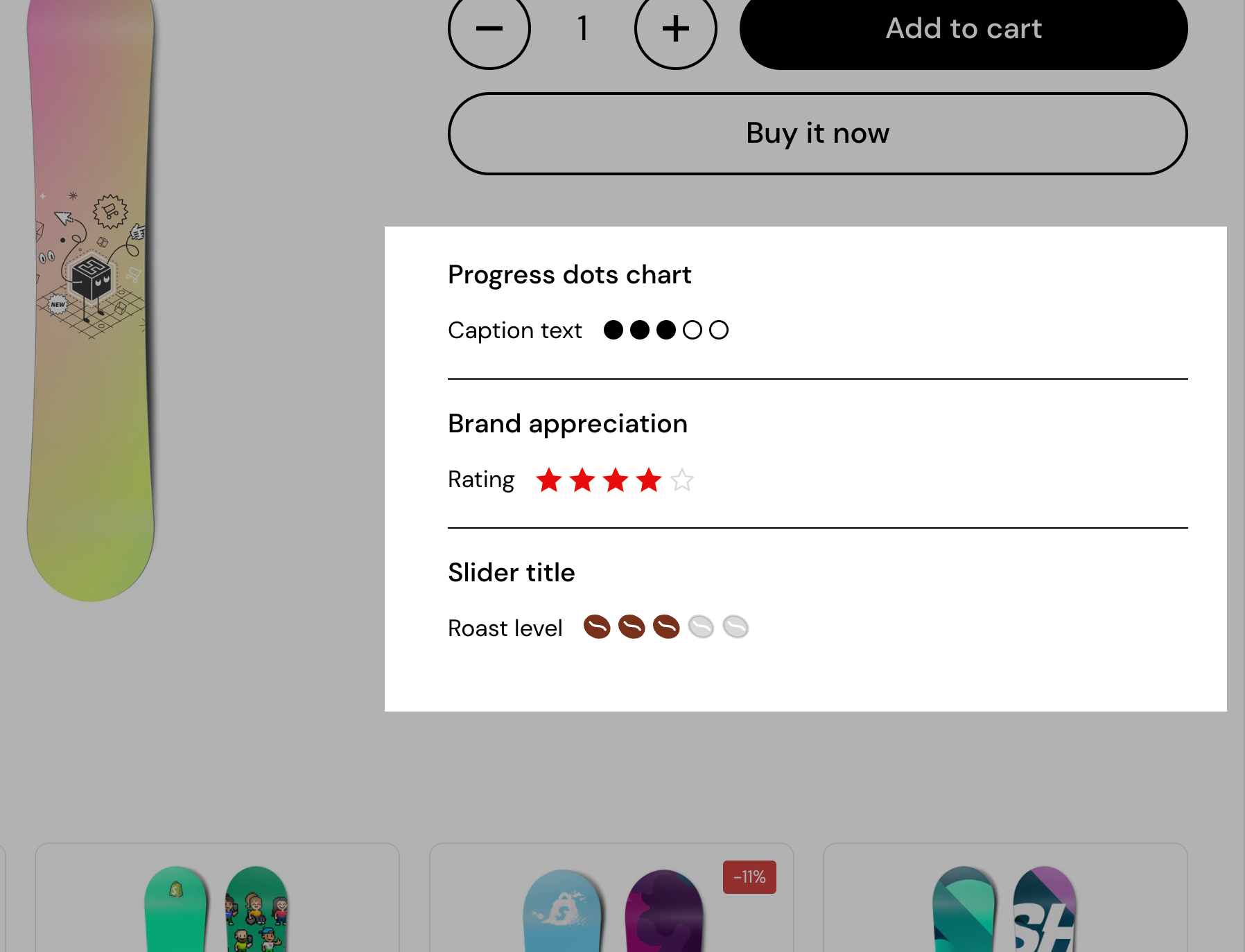
Block content
Caption - Add descriptive text or a title for the progress dots chart. This text will appear above the dots to provide context or explanation.
Dot Icon - Choose the style of the dots from available options (e.g., “Circle empty”). This determines how the progress dots will look visually.
Dot Size - Adjust the size of each dot (in pixels). Use the slider or enter a numerical value to make the dots larger or smaller.
Total Dots - Set the total number of dots in the progress chart. This defines the length or steps of the chart.
Highlighted Dots - Specify how many of the total dots should appear highlighted (e.g., filled or distinct). This is useful for representing progress or completed steps.
When connecting to a metafield, don't connect the metafield directly, but instead just type in plain text the value of the metafield (eg: custom.attribute_meter_value). See this screenshot for reference: https://share.zight.com/4gu8OvlL
Attribute meter
The Attribute Meter Block is a visual indicator used to display attributes such as product ratings, stock levels, durability, or any other numerical value that can be represented as a segmented bar. This feature is particularly useful for highlighting product qualities, making it easier for customers to assess attributes at a glance. This block provides a clear and customizable way to present product attributes, improving the user experience by offering visual context.
It can be dynamically linked to product metafields, allowing the bar to update automatically based on product-specific data.
When connecting to a metafield, don't connect the metafield directly, but instead just type in plain text the value of the metafield (eg: custom.attribute_meter_value). See this screenshot for reference: https://share.zight.com/4gu8OvlL

Block content
Each setting in the block helps customize its appearance and behavior:
Segments - Defines the total number of segments in the meter (up to 10 segments). The more segments, the finer the scale of representation.
Active segments - Determines how many of the total segments should be “filled” to indicate the attribute value. Can be manually set or linked to a metafield for dynamic updates.
Active segment metafield - Allows connecting the active segment count to a Shopify metafield. This ensures the meter updates dynamically based on the product’s attributes. Use the suggested format for it to work properly.
Active segment color - Defines the color of the filled segments.
Fill segments up to active segment - When enabled, fills all segments up to the active segment (e.g., a progress bar effect). When disabled, only the active segments themselves are filled.
Remove space between segments - Controls the spacing between segments. If enabled, segments appear as a continuous bar. If disabled, segments are separated for a more distinct visual effect.
Segments height - Adjusts the height of the segment bar. Useful for making the meter more prominent or subtle.
Show active segments value - If enabled, displays the numerical value of active segments (e.g., “4/9”). Useful for precise representation alongside the visual bar.
Start label, Middle label, End label - Optional labels that appear alongside the meter. Can be used to indicate different attribute levels, such as “Low - Medium - High” or “Weak - Strong”.
Collapsible tab
The Collapsible Tab Block is a flexible content section used to display information in an expandable format. It helps organize product details, FAQs, specifications, or additional information while keeping the page clean and user-friendly. Customers can click to expand the tab, revealing its content without cluttering the product page.
It supports text, images, and dynamic content that can be sourced from product metafields or a page.

Block content
Tab content - A rich text editor where you can enter the content displayed inside the collapsible tab. It supports basic formatting like bold, italics, lists, and links for better readability.
Tab content from page - Instead of manually entering text, this option allows you to select an existing page to pull content dynamically. This is useful for frequently updated information, ensuring consistency across multiple products.
Tab image - Allows adding an image inside the collapsible tab. You can upload a custom image, choose from free images, or link an image dynamically using a metafield.
Dynamic content - A toggle option that hides the collapsible tab if no dynamic content is available. If enabled, the block will only appear when relevant data exists, preventing empty sections from displaying on product pages.
Nutriscore
The Nutriscore block is a visual indicator used to display a product’s nutritional rating based on a predefined scoring system. It helps customers quickly understand the nutritional quality of a product using a scale that ranges from A (green, healthiest) to E (red, least healthy). The block allows for dynamic updates using Shopify metafields, making it ideal for automated product categorization.
This block is particularly useful for food and beverage stores, health-focused brands, and any Shopify store looking to provide transparent nutritional information to customers. It enhances the shopping experience by making it easy to compare product health ratings visually.

Block content
Active item - Determines which Nutriscore label is highlighted. This can be manually set or dynamically updated through a metafield.
Active item metafield - Connects the active Nutriscore to a Shopify metafield, enabling automatic updates based on product data. Useful for managing large inventories with varying nutrition scores.
Item labels (1-5) - Each Nutriscore level can be assigned a custom label. Labels can be adjusted based on branding or product categorization.
Item colors - Each Nutriscore level has a corresponding color. These colors can be customized or dynamically linked to metafields for further automation.
Text banner
The text banner block is a simple yet effective way to highlight important information on a product page. It allows merchants to display key messages such as shipping details, promotions, or special announcements in a visually distinct format. The block ensures that critical information stands out without disrupting the shopping experience.
This block is ideal for displaying urgent updates, shipping policies, promotional offers, or any key product-related details in a way that enhances clarity and improves customer engagement.

Text content - The main body of the banner, where you can add a message using a rich text editor. This supports formatting like bold, italics, and links to ensure clarity and emphasis.
Banner link - Allows adding a clickable link to the banner, directing customers to a relevant page such as a shipping policy, promotional details, or FAQ.
Open link in a new window - When enabled, the banner link will open in a new browser tab, ensuring customers don’t navigate away from the current product page.
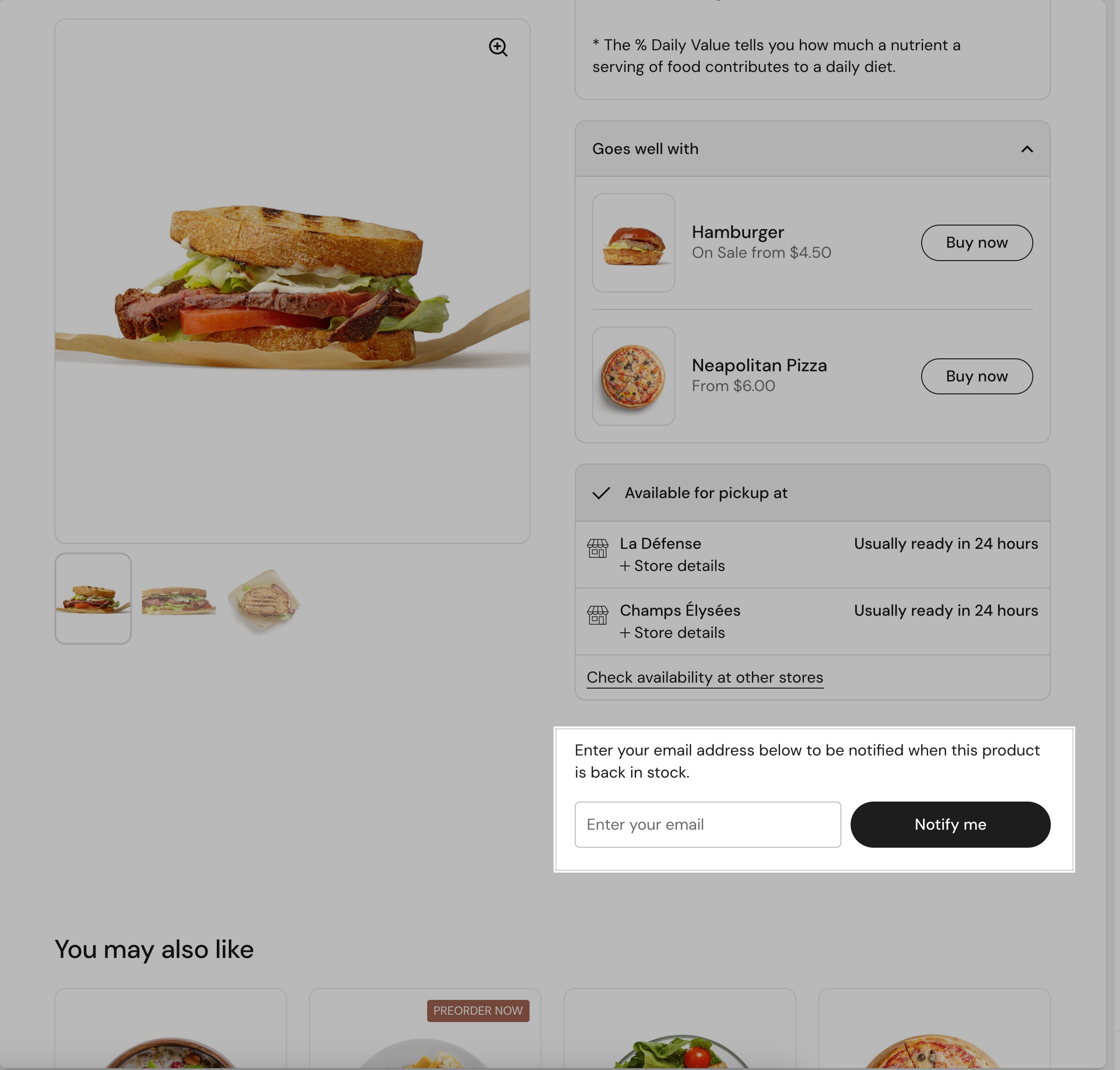
Products list
The products list block is designed to showcase a selection of products on a product page, allowing merchants to highlight related or recommended items. It is useful for showcasing complementary products, or encouraging additional purchases, making it an effective tool for boosting sales and improving the shopping experience.

Block content
Products - Allows selecting multiple products to be displayed within the list. Products can be chosen manually or sourced dynamically through metafields.
Hide block if dynamic content is not present - A toggle setting that ensures the block is hidden if no products are available. This prevents empty sections from appearing on the storefront when dynamic content is missing.
Button
The button block is a customizable call-to-action element that helps direct customers to relevant pages, such as product collections, promotions, or external links. It provides a clear and engaging way to encourage interactions and conversions.

Block options
Button label - Defines the text displayed on the button. This should be a short and action-oriented phrase like “Learn more,” “Shop now,” or “Get started.”
Button style - Allows selecting between two visual styles: Outline (a bordered button with a transparent background) or Solid (a fully filled button). This option helps match the button’s appearance to the store’s branding.
Button link - Specifies the destination URL where customers will be redirected upon clicking the button. Links can point to internal store pages, product collections, or external websites.
Open link in a new window - A toggle option that, when enabled, opens the link in a new browser tab instead of replacing the current page. This is useful for keeping visitors on the store while providing additional information.
Image
The image block allows merchants to add visual elements to their store, helping to enhance branding, storytelling, and product presentation. It supports both desktop and mobile-specific images, ensuring an optimized experience across different devices.
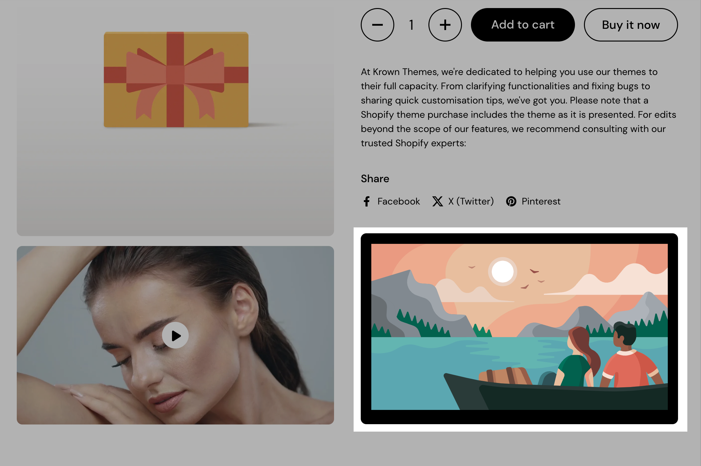
Block content
Image - The main image displayed within the block. Merchants can upload a custom image or select from free image libraries.
Mobile image (optional) - A separate image that can be uploaded specifically for mobile devices. This allows for better responsiveness and ensures images are displayed correctly on smaller screens.
Border radius - Adjusts the roundness of the image corners. A value of 0 keeps sharp edges, while higher values create more rounded corners.
Link - Allows adding a clickable URL to the image, directing customers to a product page, collection, blog post, or external site.
Open link in a new window - A toggle option that, when enabled, opens the link in a new browser tab, preventing customers from leaving the current page.
Custom HTML/Liquid
The Custom HTML/Liquid block allows you to add custom code to the storefront, enabling advanced customization beyond standard theme settings. It supports both HTML and Shopify Liquid, making it ideal for dynamic content, personalized promotions, or embedding third-party scripts.
It is useful for adding unique design elements, personalizing content based on product or customer data, and integrating custom features without modifying the theme’s core code.

Block content
Custom Liquid - A code editor where you can insert HTML, CSS, JavaScript, or Liquid code to display dynamic content. This can include product-specific details, custom messages, interactive elements, or embedded widgets.
Demo content snippet
This is the {{ product.title }} product. Would you like a 5 EUR discount? <br> <em style="font-size:14px">(Actual price <i style="color:red">{{ product.price | money }}</i> becomes <i style="color:green">{{ product.price | minus: 500 | money }}</i>)</em>
Popup
The popup block is a customizable modal window that appears on a product page, allowing merchants to display important messages, promotions, or subscription forms. It helps engage visitors by delivering relevant information without disrupting the shopping experience. Ideal for promotions, announcements, newsletter sign-ups, and special product-related messages, helping to increase conversions and customer engagement.

Block options
Heading - The title of the popup, which appears at the top of the modal.
Text - The main content of the popup, where you can add a custom message. This supports basic formatting, links, and styling to enhance readability and engagement.
Page - Allows selecting a page to pull content dynamically. If a page is selected, it replaces the manually entered text, making it useful for reusable content like terms & conditions, promotions, or FAQs.
Icons list
The icons list block is a visual representation tool that allows to showcase product features, benefits, or specifications using icons and labels. This block improves the clarity of product information, making it easier for customers to understand key attributes at a glance. Ideal for highlighting product attributes, certifications, sustainability features, or key benefits in an engaging and visually appealing way.

Block options
Layout - Defines how the icons and labels are displayed. Options include Grid (icons arranged in a structured grid), Inline (icons appear in a row), and List (icons stacked vertically).
Icon - Each list item includes an icon that represents a specific product feature or characteristic. Merchants can upload custom icons or select from free images to align with their branding.
Label - A short text description that appears next to or below each icon, providing additional context about the feature it represents.
Pickup availability
The pickup availability block displays real-time store pickup options for products, allowing customers to see if an item is available for pickup at a selected location. This feature enhances the shopping experience by providing clear fulfillment options and reducing uncertainty for customers who prefer in-store pickup.
This block is useful for offering local pickup options, improving transparency about fulfillment choices, and enhancing the shopping experience for customers who prefer in-store collection.

Block options
Style - Determines how the pickup availability information is displayed. The Compact option provides a minimal, streamlined look, while the Extended option includes additional details, such as estimated pickup times and store locations.
Layout - Controls the overall presentation of the block. The Boxed layout places the information inside a visually distinct container, while the Compact layout integrates it more seamlessly into the page.
Custom text color - Allows customization of the text color for the pickup availability block, ensuring it aligns with the store’s branding.
Custom background color - Available only for the Boxed layout, this setting enables merchants to change the block’s background color for better contrast and visibility.
Darken the header - When enabled, this setting applies a darker background or text styling to the block’s header, making it stand out more on the page.
Variant picker
The variant picker block allows customers to select different product variations, such as colors, sizes, or materials, in an intuitive and visually appealing way. This block supports multiple selection styles and inventory-based notifications to improve the shopping experience.

Block options
Variants selector type - Determines how product variants are displayed. The Blocks option shows variants as clickable swatches or buttons, supporting color swatches created with category metafields. The Dropdown option provides a compact, traditional selection.
Inventory notification - Controls how stock level messages are displayed. This feature requires inventory tracking to be enabled in Shopify.
Custom inventory notification colors - Allows customization of colors for inventory notifications to visually indicate stock levels:
- Low inventory - Sets a custom color for products with limited stock.
- Regular stock - Defines a color for items with sufficient stock availability.
- Out of stock - Highlights sold-out products with a distinct color.
Divider
The divider block is a simple design element used to create visual separation between blocks. It enhances readability and improves the structure of content by clearly defining different areas. Useful for breaking up content, adding emphasis between blocks, or improving the overall page layout with clear visual separation.

Block options
Height - Adjusts the thickness of the divider.
Color - Sets the color of the divider, allowing customization to match the store’s branding or create contrast.
(Hint: setting the color to match the page color would result in empty space with variable height ;) )
Style - Defines the appearance of the divider. Options include solid, dashed, dotted, or double, providing different aesthetic choices to fit the design.
Price
The price block is a key element in product pages that displays the pricing information of a product, including sale prices, discounts, and currency formatting. It ensures clear and effective communication of product costs to customers.

Product siblings
Product siblings are used to group similar or related products (like different colors or prints) while keeping them as separate products — for better SEO, inventory control, and a smoother user experience.
Watch this video for a complete rundown of the how to use the feature.
Title
The title block displays the product name prominently on the product page, ensuring customers can easily identify the item they are viewing. It is a fundamental element that contributes to a clear and structured product presentation.

Product rating
Will show the product's rating if there is an app for reviews. The product rating block displays customer reviews and ratings for a product, helping build trust and influence purchasing decisions. It provides a visual representation of customer feedback, typically shown as star ratings.
Make sure you that you also set the app that you are using for reviews in the Theme Customizer > Settings > Product Card > Product ratings settings. You can also use app blocks to show product ratings instead of the block that comes with the theme.

Text
The text block allows merchants to add custom text content to a product page, providing additional details, disclaimers, instructions, or promotional messages. This block helps improve communication and enhances the user experience by offering relevant information in a clear and structured way.
This block is ideal for adding product descriptions, important notices, policies, disclaimers, or promotional messages, ensuring customers receive essential information in a visually structured format.
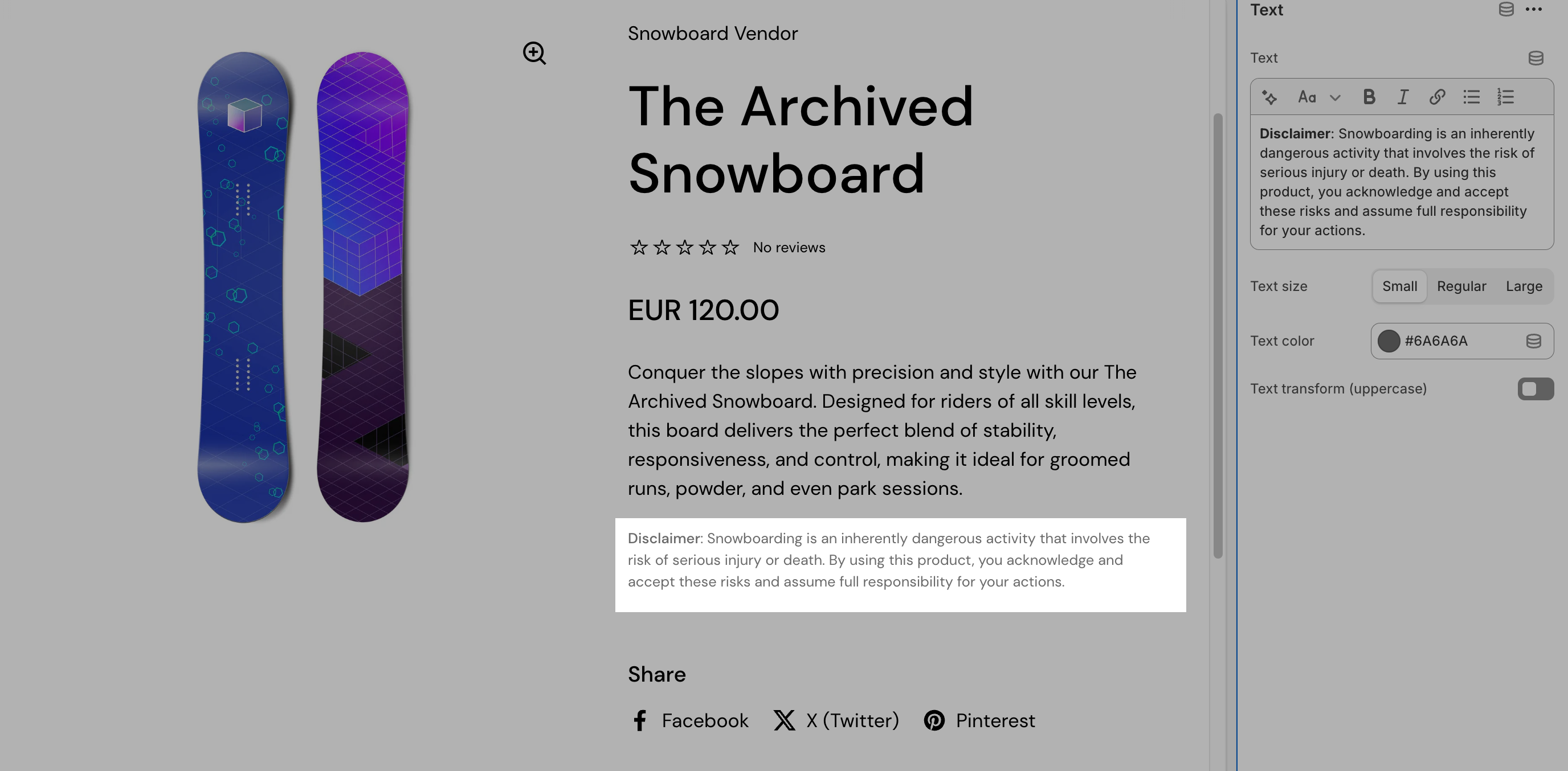
Block options
Text - A rich text editor where merchants can enter custom content. It supports basic formatting options such as bold, italics, links, and lists to improve readability.
Text size - Allows selecting between small, regular, or large text sizes, ensuring flexibility in how the information is presented.
Text color - Defines the color of the text, allowing customization to match the store’s branding or create contrast for better visibility.
Text transform (uppercase) - A toggle option that, when enabled, converts all text into uppercase letters for a bold and attention-grabbing effect.
Description
The description block displays the product’s detailed description, providing customers with essential information about the item. This block pulls content directly from the Shopify product description field, ensuring consistency across product pages.

This block is essential for providing in-depth product information, improving SEO, and enhancing the shopping experience by giving customers all the details they need to make an informed purchase.
Buy buttons
The buy buttons block provides customers with clear purchasing options, making the checkout process more efficient. This block allows merchants to customize the appearance and functionality of the main product purchase buttons.
This block is essential for streamlining the purchasing process, enhancing customer convenience, and increasing conversions with optimized checkout options.

Block options
Show price - When enabled, displays the product price directly within the buy button section, reinforcing the cost before purchase.
Show quantity selector - Adds a quantity selection input, allowing customers to specify the number of units they want to purchase.
Show “pre-order” button label - Displays a “Pre-order” label instead of “Buy now” for products that are available for pre-order. This helps clarify product availability.
Show dynamic checkout buttons - Enables express checkout options, allowing customers to purchase using their preferred payment method (e.g., PayPal, Apple Pay, Google Pay) directly from the product page.
Show recipient information form for gift card products - When enabled, allows customers to enter recipient details (such as email and a personal message) for gift card products, ensuring the gift card is sent to the intended recipient.
Custom colors - Allows customization of button colors:
- Text - Defines the color of the button’s text.
- Accent - Sets the background or border color of the button.
Button style - Selects between Outline (a bordered button with a transparent background) or Solid (a fully filled button) to match the store’s branding.
Custom property
The custom property block allows you to add any text for products custom line proprieties. These info will be included in the order summary and you can set it as either text, checkbox or dropdown.

Share
The share block allows customers to easily share product pages on social media platforms, increasing product visibility and engagement. It provides built-in sharing options for popular social networks and a customizable link option.

Block options
Show Facebook - Enables a Facebook share button, allowing customers to post the product link directly to their timeline.
Show X (Twitter) - Displays a share button for X (formerly Twitter), letting users post a tweet with the product link.
Show Pinterest - Adds a Pinterest share button, allowing customers to save the product image and link to their Pinterest boards.
Show custom link - Provides an option to enable a custom sharing link, which can be configured to share via alternative platforms or messaging apps. Uses native browser sharing when supported.
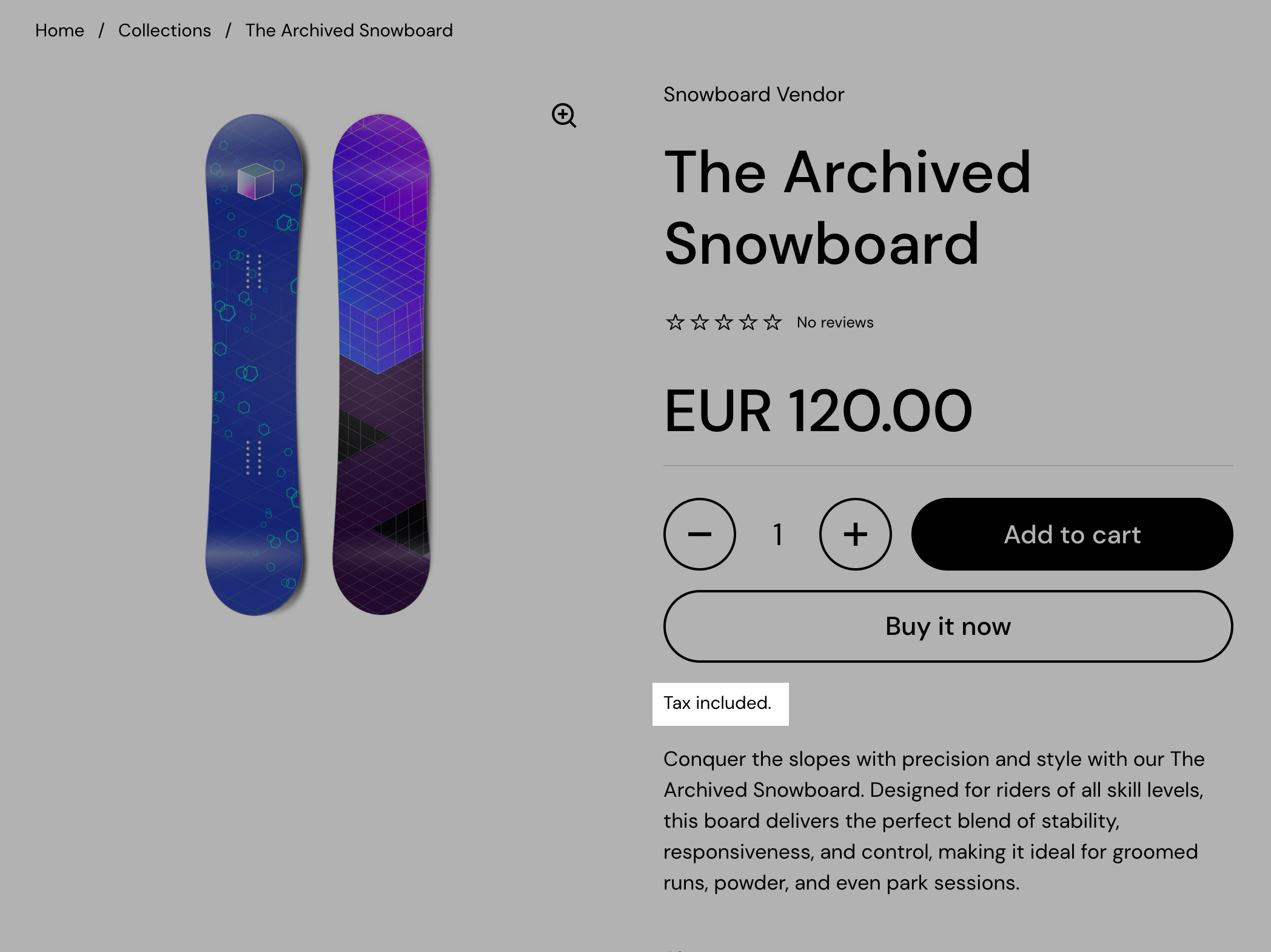
Tax information
Displays a "tax included" notice for stores where this is a legal requirement. This block is useful for enhancing pricing transparency, improving customer trust, and ensuring compliance with tax regulations in different regions.
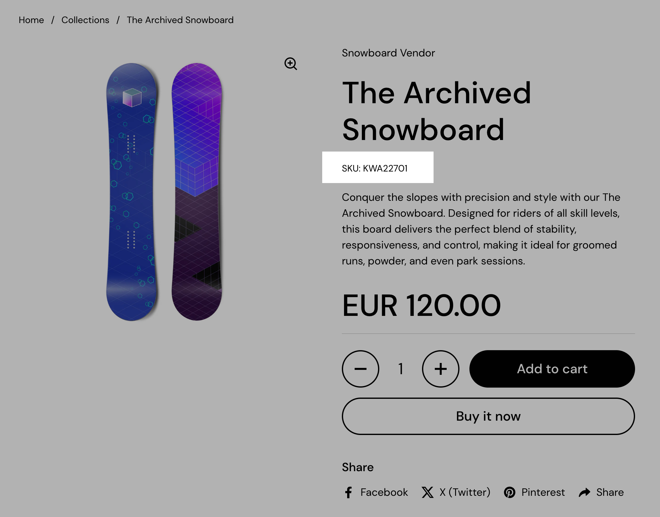
SKU / barcode
The SKU/Barcode block displays the product’s Stock Keeping Unit (SKU) and, if available, the barcode, providing essential inventory management details. This information is useful for both merchants and customers who need to reference product identification codes.
Back in stock alert
This back in stock alert form will show up when the product is out of stock.
Store owner will receive an email when a customer fills in this form. Store owner must manually notify the customer once the product is back in stock.
You can add your own text, button label, success message and email message using the included theme customiser options for this block.