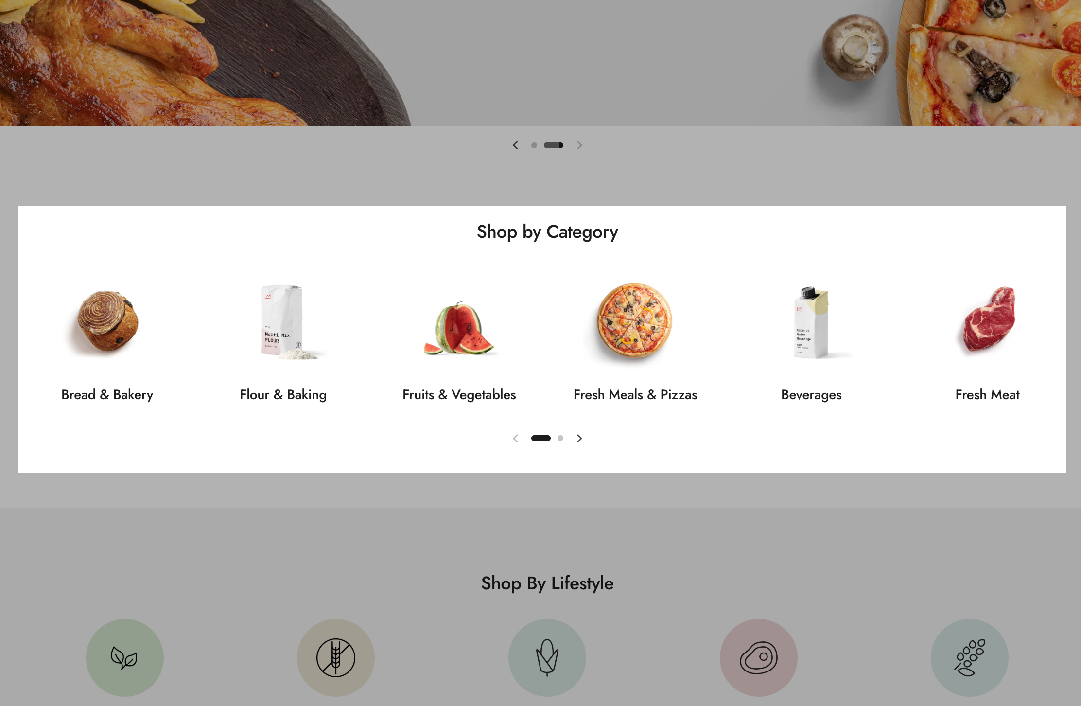
Local > Sections > Collection list
Collection list
Used to display collections from your store. You can choose between the layout and number of columns (if you have less or more items) in order to achieve the design you want. Each collection's default image can be overwritten by a custom one.

Section content
Layout - Determines how collections are displayed:
- Slider - Displays collections in a horizontally scrollable carousel.
- Grid - Shows collections in a static grid layout.
Desktop layout - Defines the number of collection columns on desktop view (2-6 columns). The layout automatically adjusts for mobile devices.
Media aspect ratio - Controls the proportion of images within the collection cards. Options include:
- Short (4:3) – A slightly wider rectangular format, ideal for images with more horizontal content.
- Square (1:1) – A perfect square, ensuring equal width and height for a balanced and uniform display.
- Tall (5:6) – A slightly taller format, suitable for images with more vertical content.
- Taller (2:3) – A more elongated vertical format, best for portrait-style images.
This setting helps merchants achieve a cohesive visual style while adapting to different types of product or collection images.
Custom card design options
Background - Customizes the background color of the collection cards.
Text - Sets the text color for collection titles and descriptions.
Border - Defines the border color around collection cards.
Shadow - Adds a shadow effect around the cards for a more distinct or elevated look.
Hide border - Removes the border around collection cards for a cleaner design.
Hide shadow - Disables the shadow effect for a flatter, minimalist appearance.
