
Local > Sections > Promotion cards
Promotion cards
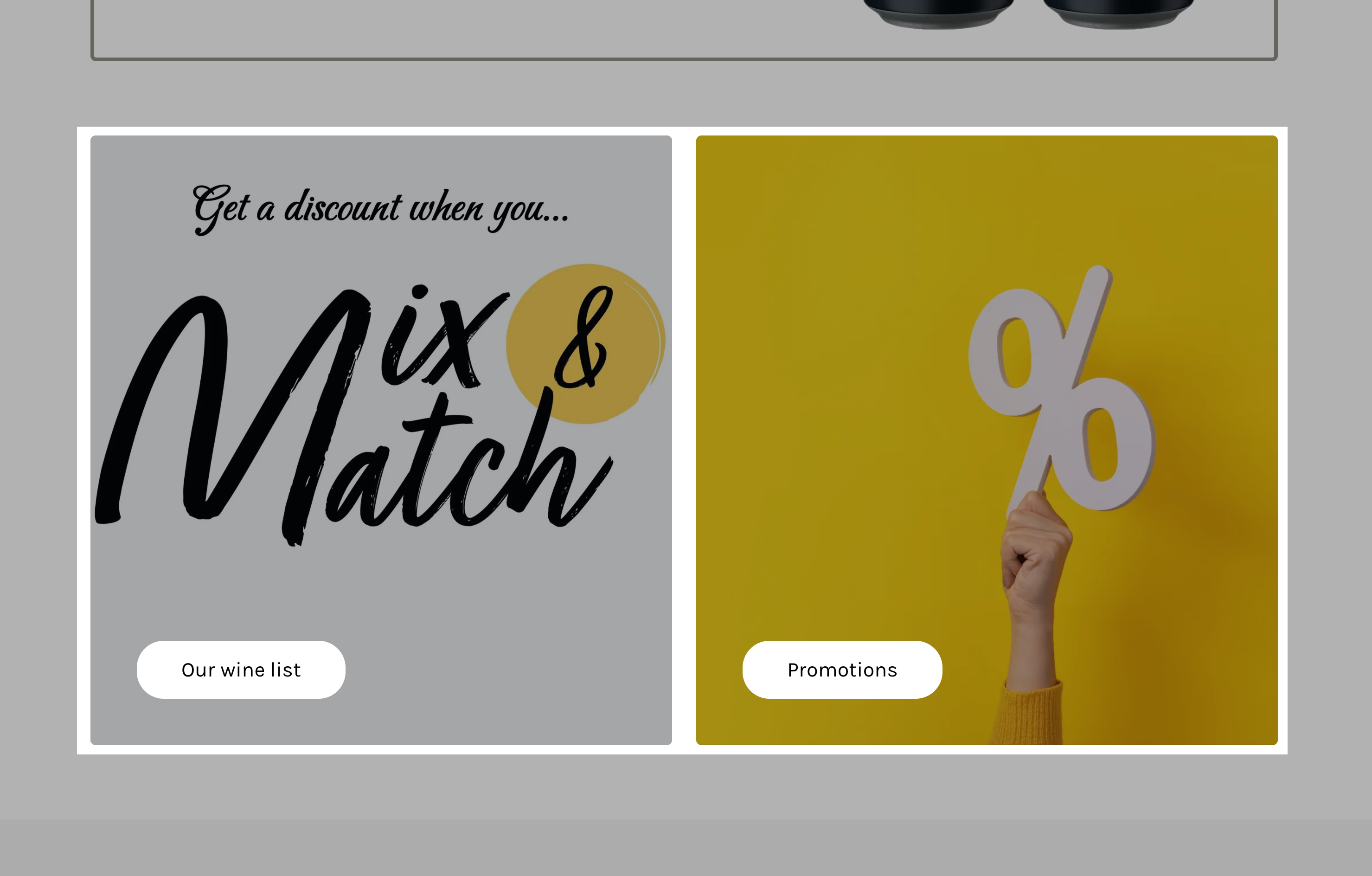
Another versatile section is this, which is somehow similar to the previous one in terms of content, but it's different because the image comes above the text, in a card-like layout. Also, this doesn't have support for video backgrounds.

Promotion cards - section options
Desktop layout - Defines how the promotion cards are displayed on desktop screens. The options allow for a structured grid format, while the layout adapts for mobile devices.
Media aspect ratio - Determines the shape of the images within the promotion cards.
Text alignment - Controls where the text appears within the card (Left, Center, or Right).
Caption size - Adjusts the size of the small text that appears above the title (Small, Regular, Large).
Title size - Defines the size of the main heading on the promotion card.
Subtitle size - Controls the size of the subtitle text (Regular or Large).
Button size - Adjusts the call-to-action button size (Regular or Large).
Button style - Determines whether the button appears as Outline (bordered) or Solid (filled background).
Button width - Defines whether the button is Fullwidth (stretches across the card) or Contained (smaller, inline style).
Background color - Sets the background color for the section.
Background gradient - Adds a gradient effect for a more dynamic design.
Heading text color - Allows customization of heading text color for better contrast.
Remove top margin - Eliminates extra spacing above the section for better alignment with adjacent content.
Promotion cards - card options
Customize the design and content of each promotional card, making them ideal for showcasing featured collections, discounts, or announcements.
Caption - A short introductory label that appears above the main title (e.g., “New Collection” or “Limited Offer”).
Title - The main heading of the promotion card, designed to grab attention (e.g., “Emphasize a collection”).
Subtitle - A secondary description providing more details about the promotion or product.
Link - Adds a clickable URL to the card, directing customers to a specific page (e.g., a collection, product, or promotional page).
Open link in a new window - When enabled, the link opens in a new browser tab instead of replacing the current page.
Button label - Defines the call-to-action (CTA) text on the button (e.g., “Show more,” “Shop now”). If left blank, the entire card becomes a clickable link.
Background - Sets a custom background color for the promotion card.
Text - Customizes the text color for better contrast and readability.
Accent - Adjusts the highlight or accent color used within the card.
Border - Allows merchants to define a border color, giving the card a framed appearance.
Shadow - Adds a drop shadow for a more elevated or layered design.
Hide border - Removes the border from the card for a cleaner, seamless look.
Hide shadow - Disables the shadow effect for a flatter, minimalist design.