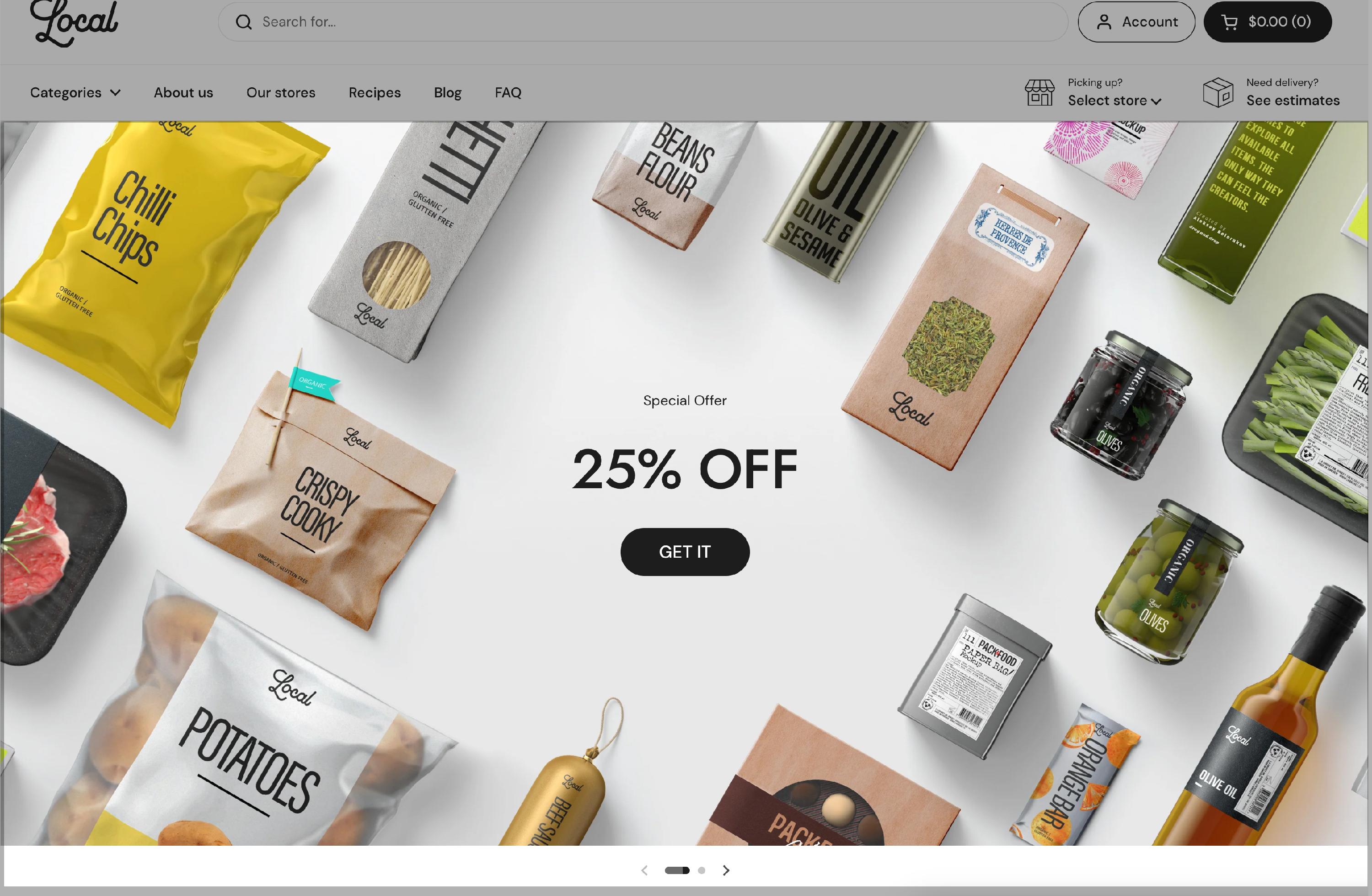
Local > Sections > Slideshow
Slideshow
Your regular horizontal slideshow packed with many options. You can choose it's desktop / mobile height, make it fullwidth or card-like design, change the text's style & alignment, even add separate images for desktop / mobile.

Slideshow options
Desktop height - Defines the height of the slideshow on desktop devices (Small, Medium, Large options available).
Mobile height - Sets a different height for mobile screens to ensure responsiveness.
Auto height - If enabled, the slideshow’s height will automatically adjust based on the images inside each slide, ignoring the fixed height settings.
Enable autorotate - When enabled, the slideshow automatically cycles through slides without user interaction.
Interval - Adjusts the time between slide transitions.
Text alignment - Controls where the text appears within the slide.
Text container width - Defines how wide the text area should be (Medium, Large, Full).
Text spacing - Adjusts the spacing between text elements.
Caption size - Controls the size of the slide’s caption text.
Heading size - Adjusts the size of the main heading text on slides.
Button size - Customizes the call-to-action button size (Regular or Large).
Button style - Allows merchants to choose between Outline (bordered button) or Solid (filled button) styles.
Fullwidth - Expands the slideshow to fill the entire screen width, creating an immersive effect.
Background color - Sets a custom background color behind the slideshow.
Background gradient - Allows adding a gradient effect instead of a solid background.
Navigation elements color - Customizes the color of slideshow navigation elements (arrows, dots).
Remove top margin - Removes extra spacing above the slideshow for better alignment.
Hide border - Removes the border around the slideshow for a cleaner look.
Hide shadow - Disables the drop shadow effect for a flatter appearance.
Disable parallax effect - When enabled, prevents the parallax scrolling effect, improving accessibility for all users.
This section is perfect for showcasing promotions, featured collections, and brand messaging with an interactive and visually appealing format.
Slideshow - slide options
Each slideshow slide can be customized with images, videos, text, and buttons, allowing merchants to create engaging, visually appealing slides that showcase promotions, featured products, or brand messaging.
Image - Upload or select an image to display on the slide.
Mobile image (optional) - Allows setting a different image for mobile devices to ensure optimal display on smaller screens. If not set, the main image will be used.
Caption - A short introductory text that appears above the title (e.g., “Showcase your best products”).
Title - The main heading of the slide, which grabs attention (e.g., “Welcome to our store”).
Link - Allows adding a clickable link to the slide. This link will be applied to the button, the title (if no button exists), or the entire slide (if both the title and button are blank).
Open link in a new window - When enabled, the link will open in a new browser tab instead of replacing the current page.
Button label - Defines the call-to-action (CTA) text on the button (e.g., “Learn more”). If left blank, the entire slide can act as a clickable link.
Overlay - Adjusts the overlay color applied to the slide, improving text visibility.
Text - Allows merchants to customize the text color for better contrast and readability.
Video file - Upload a video instead of an image. If the video cannot be played, the uploaded image will be displayed as a fallback.
