
Combine > Sections > Media with text overlay
Media with text overlay
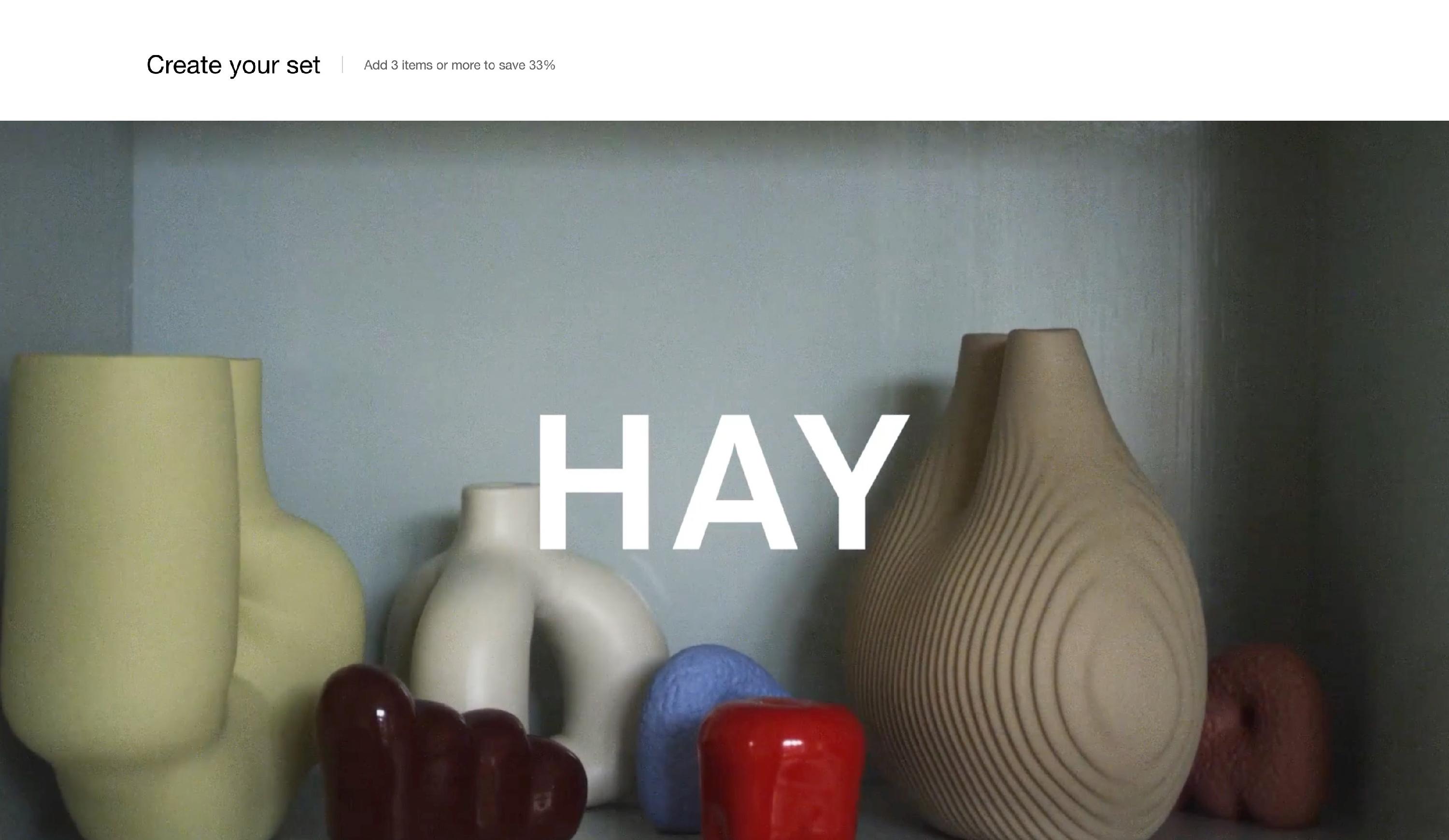
This is one of the theme's most versatile sections, with support for different layouts, text styles, images or video backgrounds, a lot .. You can choose the number of columns, the card's height, play with the text sizes and inside each individual block you have a place for a background image or a video, and a few lines of text. Each block has it's own color options so it can really adapt to any kind of backgrounds.
Please note that the video backgrounds require MP4 files, which need to be added separately in your Shopify > Content > Files admin area.
Media with text overlay – section options
Desktop layout - Defines how the media is arranged on desktop devices: fullwidth or boxed in columns (up to 3).
Card height - Controls the height of the section for better proportion and layout: Small, Large, Extra large.
Text alignment - Positions the text within the media overlay.
Text container width - Defines how wide the text area should be:
- Medium – A balanced width.
- Large – Expands text width for better readability.
Caption size - Controls the font size of the caption text, available in regular, large or extra large.
Title size - Adjusts the size of the main heading to regular, medium or large.
Subtitle size - Defines the subtitle text size, with regular large and extra large options.
Text spacing - Provides the option to control the spacing between the included section texts.
Button style - Determines the appearance of the button:
- Outline – A button with a transparent background and border.
- Solid – A fully filled button for stronger emphasis.
Border radius - Controls the card edges - here you can make the card corners round increasing the border radius value.
Background color - This option is for the entire section background, not the content card background.
Background gradient color - Instead of a plain color, you can also choose a gradient background color.
Heading text color - Controls your section header text color only.
Decrease top margin - Determines the distance between this section and the one before it.
Remove top margin - Completely removes the space between this section and the previous one.
Remove bottom margin - Completely removes the space between this section and the next one.
SEO - Specify heading level to help search engines index the structure of your page.
Media with text overlay – card options
Image - Upload or select an image that will serve as the background for the card.
Video file - Optionally upload a video file instead of an image. If the video cannot be played, the uploaded image will be used as a fallback.
Caption - A short introductory text that appears above the title, useful for categories like “Introducing” or “New Arrival.”
Title - The main heading of the card, designed to grab attention (e.g., “Your Best Promotion Yet”).
Subtitle - A secondary description providing more context about the offer, product, or announcement.
Link - A URL field where merchants can attach a clickable link to the title, button, or the entire card.
Button label - Defines the call-to-action (CTA) text on the button (e.g., “Shop Now” or “Learn More”).
Overlay - Adjusts the overlay color applied over the media, helping improve text visibility.
Text - Allows merchants to customize the text color for better contrast.
Show horizontal line - Adds a small horizontal line after your section text.
SEO - Specify heading level to help search engines index the structure of your page.
This section is ideal for promotional banners, featured collections, and product highlights, providing an engaging and visually impactful way to present content.