
Combine > Sections > Text columns with icons/images
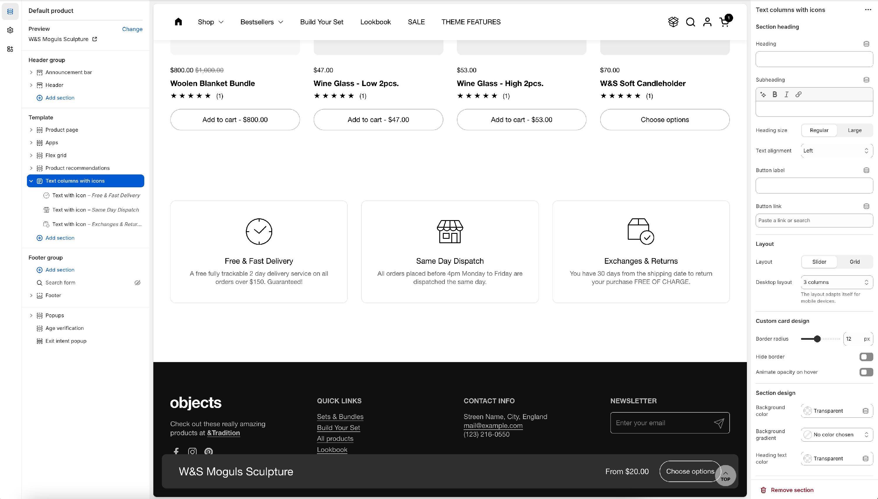
Text columns with icons
A versatile section that can be used for so many purposes - it features a grid or slider design, you can choose the column's number, and change each individual icon's design (color).
We've included a small pack of icons in the theme, but you can also upload your own and of course, download any icon from our free icon's tool: https://resources.krownthemes.com/icons/
Section options
Section heading - Provides the option to add and control a general text for the entire section.
Heading and subheading - Choose if you want to add a heading and subheading text for the section.
Heading size - Adjust the header text font size: regular or large.
Text alignment - Defines how the text is displaying on either one row - left side or two rows - left/center
Button label and button link - The button will display in the header section above the text columns.
Layout - Defines how the columns are displayed:
- Slider – Icons and text scroll horizontally in a carousel format.
- Grid – Displays icons and text in a static multi-column layout.
Desktop layout - Determines the number of columns displayed on desktop devices. The layout automatically adjusts for mobile screens.
Border radius - Adjusts the roundness of the icon background or card edges. 0 px keeps sharp edges while higher values create a more rounded or circular shape.
Hide border - Choose if you want to include or not a boarder around each text with icons block.
Animate opacity on hover - Adds an highlight animated effect on hover if enabled.
Item options
Each item in the Text Columns with Icons section represents a feature, service, or informational point with an image, title, caption, and optional link.
Image - Allows merchants to upload or select an icon or image (e.g., shipping, customer support, security). Recommended size: 256 x 256px.
Title - The main heading for the item (e.g., “Shipping”).
Caption - A brief description providing additional details (e.g., “Useful information about your shipping details”).
Link - Allows merchants to add a clickable link, directing customers to more detailed pages.
This section is ideal for highlighting store policies, service benefits, or product features in a visually structured and easy-to-read format.
Text columns with images
Similar to the section above, it has the same settings, the difference being in the fact that this one uses images instead of icons.