
Seventh > Sections > Product recommendations
Product recommendations
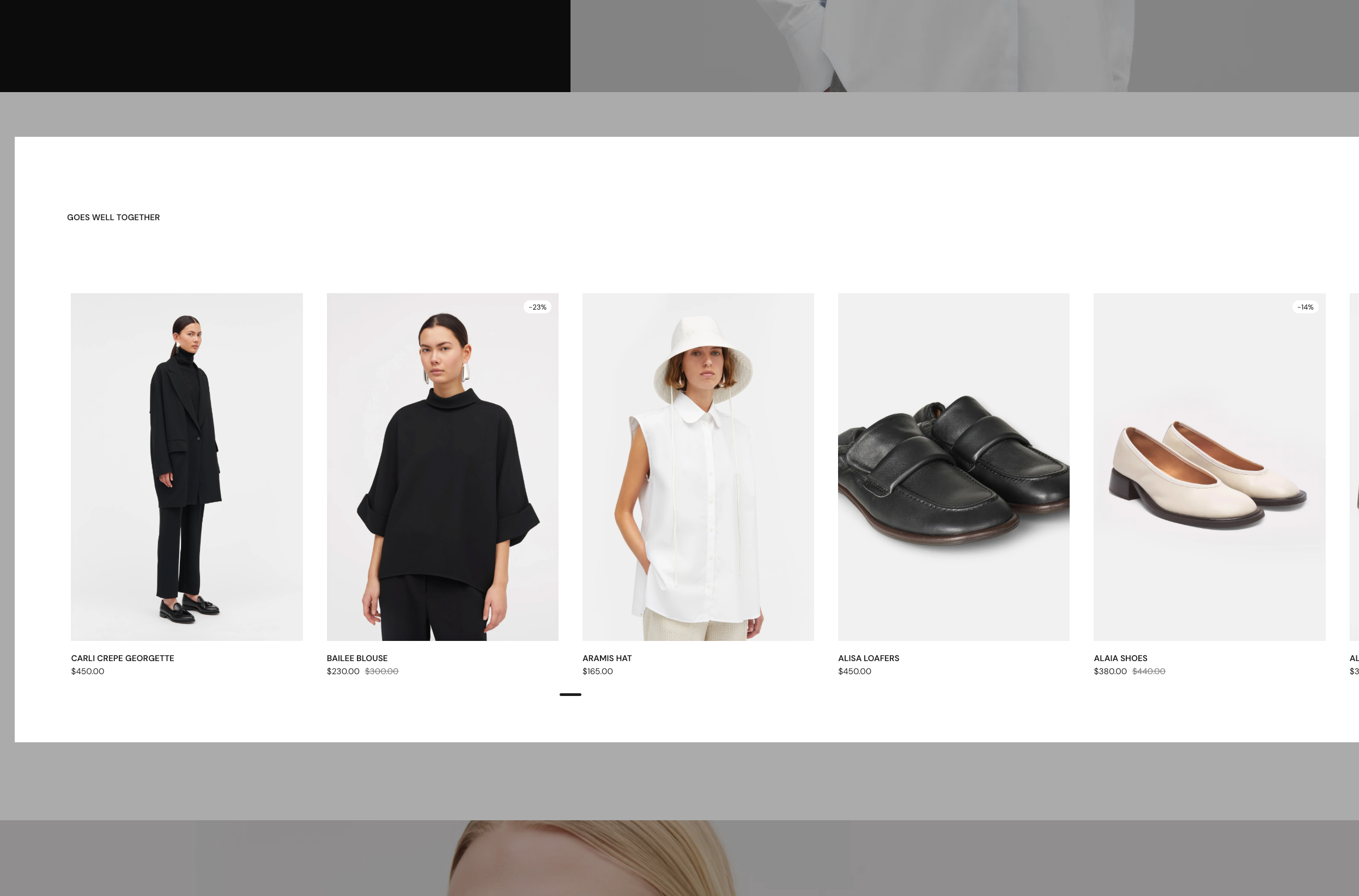
The Product recommendations section automatically displays product recommendations based on the current product being viewed. Perfect for showing "You may also like" or "Related products" on product pages.
What it does
This section automatically creates product cards for recommended products:
- Displays products recommended by Shopify based on the current product
- Recommendations appear automatically when viewing a product
- Each recommended product uses a Product Card with customizable blocks
- Products appear in a grid or slider layout
- Recommendations are powered by Shopify's recommendation engine
Section settings explained
Product Recommendations
Maximum Products to Show
- Controls how many recommended products to display
- Range: 1-12 products (default: 4)
- Shows the most relevant recommendations up to this limit
Note: Product recommendations are powered by Shopify's recommendation engine.
You can adjust recommendations by installing Shopify's Search & Discovery app.
Recommendations may not appear immediately if Shopify hasn't generated them yet for your store.
Product Card Options
Each recommended product uses a Product Card. You can customize what information appears on each card.
👉 Read more about product cards here: https://shopify-support.krownthemes.com/article/978-seventh-blocks-product-card
Common use cases
Related products
- Display on product pages
- Show 4-6 related products
- Use grid layout with 3-4 cards per row
- Add section header with "You may also like"
Upsell products
- Show complementary products
- Display products that go well together
- Use slider layout for featured display
- Encourage additional purchases
Product discovery
- Help customers find similar products
- Increase average order value
- Use standard grid for easy browsing
- Show products from same collection or category