
Seventh > Pages > Product page
Product page
The Product page (short: PDP) shows a single product with its media, details, and purchase options.

What it does
The most important page on your store, it presents a single product with its media gallery, key details, and purchase actions. It’s designed to guide visitors from discovery to checkout with clear visuals and structured information.
Key elements include the product gallery, title and price, variant selection, and add‑to‑cart actions. Optional blocks like ratings, inventory availability, share links, and complementary products help answer questions and increase confidence before purchase.
Product gallery
Controls how product images and videos are displayed on the Product page. The gallery can be configured as a full-viewport layout (Cover) or as a structured column layout (Classic). Available settings depend on the selected style.
Cover style
Displays product media in a full-viewport layout. Works great for high end, clean, product imagery created in the same style.
Media style
Fit: Media fits the viewport height while preserving its aspect ratio. The entire image remains visible.
Crop: Media expands to fill the viewport (100% screen height). Parts of the image may be cropped depending on screen size.
Scroll: Media is cropped and scrolls with the viewport. Images may extend vertically beyond the initial view.
Use cases
Fit: Works very well with tall portrait images that have a similar background and style, because the user might see more than one image at a time (on desktop).
Crop: Works well if you want a single image to fill in the entire viewport and it's not an issue if you'll get cropping. Works better with landscape images.
Scroll: The most immersive one, where the product image will fill not only the viewport, but expand beyond it.
Media position (Fit only)
Defines how media aligns within the layout. You can either show multiple images at once, or choose to show a single image, aligned in a corner or in the middle. Experiment with whatever works best for your specific case.
Enhance first image (Classic style only)
In the classic product gallery style, when the layout is set to 2 columns, on desktop, you can show the first image (media) in fullwidth,
Media focal point (Crop only)
Controls which part of the image remains visible when cropping is applied. Should be used to focus on the essential area of the image (eg. the head of a model)
Media overlay: Adds an overlay on top of the media. It features an opacity slider so you can fine tune the color.
Show thumbnails: Displays media thumbnails on desktop devices. On mobile devices, the thumbnails will be replaced by classic slider navigation.
Parallax effect: Adds vertical parallax movement while scrolling.
Options: None, Small, Medium, Large
Parallax requires extra cropping, so bigger parallax strength = more cropping to the images.
Mobile media style
Just for the cover gallery style, you can style the mobile experience separately.
Switch to classic media style on mobile
Displays the product slider below the header, as an independent item, as opposed to having it absolutely positioned as a hero gallery behind the header.
Media aspect ratio: Defines the image ratio used on mobile devices.
Media focal point: Controls cropping position on mobile when applicable.
Fit media inside container: Keeps media aligned within the content container instead of extending edge-to-edge.
Classic style
Displays product media alongside product information in a column layout. Works for any kind of product imagery.
Media layout: Choose the style (slider or scroll) and the number of media columns on desktop (for scroll only). Defaults to a single-column slider on mobile devices.
Desktop media width: Controls how much horizontal space media occupies.
Enable image zoom: Allows zoom interaction on product images.
Media aspect ratio: Defines the image ratio used for media.
Media focal point: Controls cropping position when applicable.
Fit media inside container: Keeps media aligned within the content container instead of extending edge-to-edge.
Enable horizontal parallax in slider: Adds horizontal parallax movement between slides.
Enable video looping - Videos loop continuously, rather than pausing after the last frame.
Enable video autoplay
When videos are autoplaying, they will be muted and they will not pause when the user interacts with the variants.
Filtering media by variant
If your store offers products with multiple visual variations, such as different colors, patterns, or styles, the "Filer media by variant" option allows you to display only the images associated with a particular variant on a product page. For example, only show the white images when the customer selects the white color option.
This smart feature enhances the shopping experience by only showing relevant images. It keeps product pages organized and improves focus.
How to group media by variant
- Order the product images to ensure all the images for the chosen variant are grouped together (eg: 3 black, 3 white, etc.)
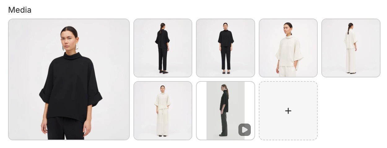
- Assign the first image of each group to the proper color variant (eg: first black image is associated with the Black variant, first white image with the White variant, etc.)
- Enable the feature by checking the Filter media by variant checkbox on the Product page gallery settings.
If you have lifestyle images that you want to show up for all the variants, you can set these by giving them the #all alt text. Any image that has this alt text will show up in all variants.
Note: Videos or 3d models will be displayed for all the variants.
Section settings
Controls the overall styling and behavior of the Product page section.
Section design
Color scheme: Applies a color scheme to the Product page section.
Top padding: Controls the spacing above the section.
Bottom padding: Controls the spacing below the section.
If the Product gallery style is set to Cover, the section design settings apply only on mobile devices.
Functionality
Select the first available variant by default
Automatically selects the first available product variant.
If disabled, customers must manually select a variant before adding the product to cart.
Sticky add to cart
Adds a persistent add-to-cart bar while scrolling. This displays a purchase bar when the main add-to-cart area scrolls out of view.
Product page blocks
Product title
Displays the product name prominently so customers can identify the item immediately. The title is typically the first piece of information users scan after viewing the product media, and it establishes the visual hierarchy for the rest of the page.

Block options
- Typography: font, size, line height, case, weight, opacity, color
- SEO HTML tag for the heading
A clear, well-styled title improves scannability and helps anchor pricing, badges, and ratings around it for faster decision-making.
Product price
Shows the current selling price along with any compare-at price to communicate discounts clearly. Pricing is a major decision-making element and is often read alongside badges (“Sale”) or inventory notices to increase urgency and transparency.

Block options
- Typography: size, case, weight, opacity, color
When styled well, it supports both clarity and conversion.
Product description
Pulls in the product’s long-form description for additional detail and SEO value. Use it to explain benefits, materials, size/fabric info, and care instructions — anything that helps remove doubt and supports purchase confidence.

Block options
- Typography: size, line height, case, weight, opacity, color
Longer descriptions can also help with organic search performance.
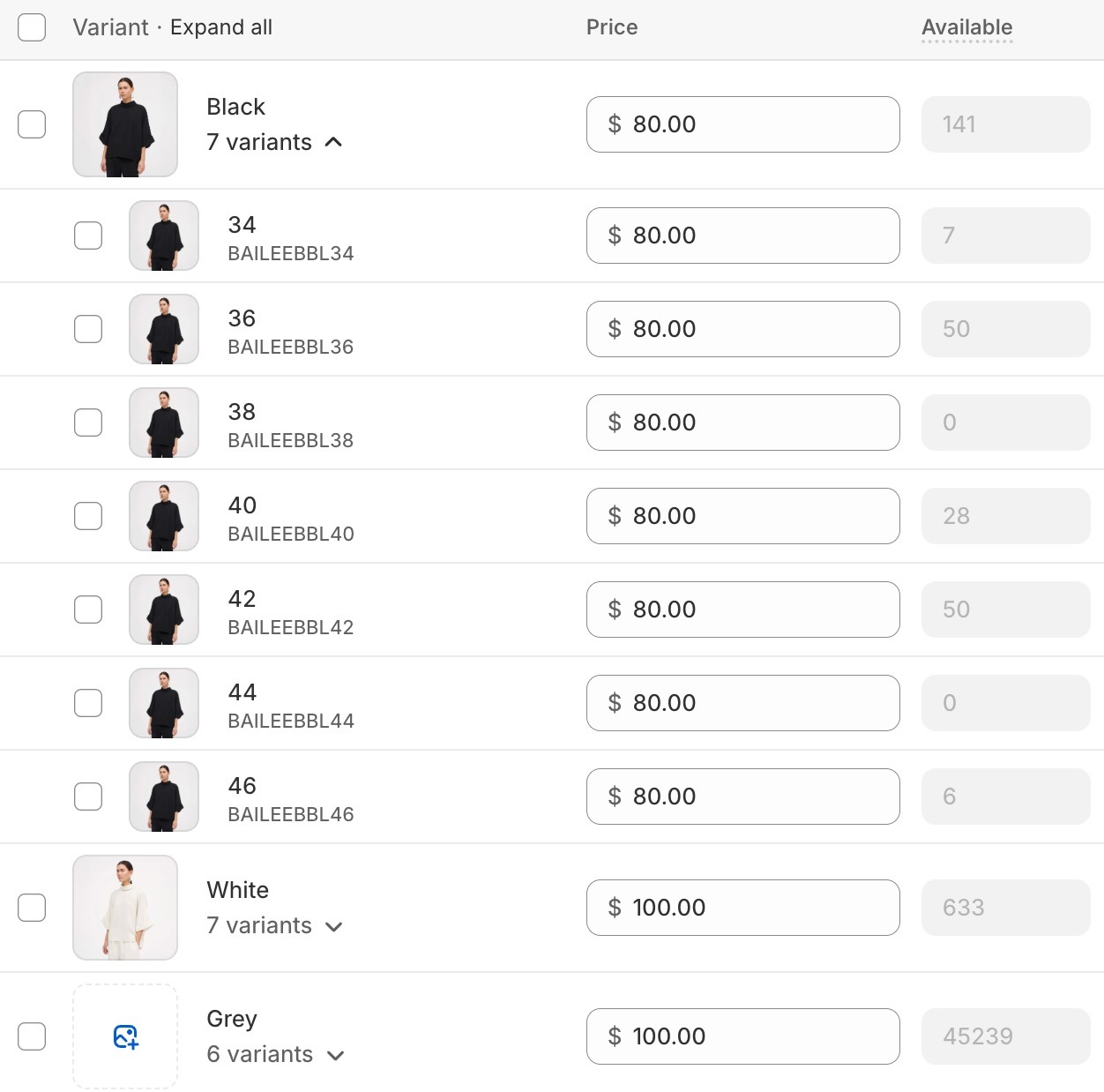
Product variants
Lets customers choose options like size or color; it can be displayed as blocks or dropdowns depending on the selector style. This is required for products with multiple variants and controls which variant is added to cart.

Block options
- Variant selector type (blocks or dropdown)
- Unavailable variants (hide, disable, show)
- Swatch size and display mode
- Tooltip image for swatches
- Size guide text, page, and open behavior
Add to Cart (Buy Buttons)
Provides the main purchase action and can include quantity controls or dynamic checkout buttons.

Block options
- Show quantity selector
- Show price in the button area
- Pre‑order label
- Dynamic checkout buttons
- Gift card recipient form
This block handles pre-order states and gift-card recipient fields when applicable.
Product rating
Displays review stars and count when a reviews app is installed. Ratings add social proof and work well near the title and price.

Block options
- Text size
Product badges
Highlights labels such as sale, new, or custom badges for quick scanning.
Block options
- No block‑level options
Badges help communicate status at a glance and are effective when combined with pricing and imagery.
Product vendor
Shows the vendor or brand name for added context. Useful for multi-brand stores and can link to vendor collections.

SKU / Barcode
Displays product identifiers such as SKU or barcode. Useful for wholesale or inventory-focused workflows. This block is especially helpful for B2B or wholesale customers who rely on product codes.
Block options
- Typography: size, case, weight, opacity, color
Tax info
Communicates tax‑included or shipping policy messaging when configured. It reduces checkout surprises by clarifying pricing or linking to shipping policies.

Block options
- Text size
- Case
- Reduced opacity
Inventory availability
Shows stock status and low‑stock messaging when inventory tracking is enabled.

Block options
- Show quantities (below threshold or always)
- Low inventory threshold
- Colors for low, regular, and out‑of‑stock
- Text size and reduced opacity
It can create urgency for limited stock or clarify when items are unavailable.
Local availability
Indicates pickup availability by location when local pickup is enabled. This is useful for stores offering in‑store pickup and can improve conversion for local buyers.

Block options
- Text size
Product share
Adds social sharing links for the product page. Sharing helps drive organic visibility and can be placed near the CTA or below details.

Block options
- Typography: size, case, weight, opacity, color
Complementary products
Shows related add‑ons for upsells or cross‑sells. This block encourages larger cart sizes by suggesting items that pair well with the main product.

Block options
- Products number
- Heading text
- Heading typography: size, case, weight, opacity, color
Complementary products can be set up individually for each product, using the Shopify Search & Discovery app.
Product siblings
Allows you to link multiple products together and display them as swatches inside a block, instead of using product variants. This is useful when different colors (or other major distinctions) are set up as separate products rather than variants of a single product — improving discoverability, clarity, and conversion.

Block options
- Heading
- Products list (supports dynamic source via metafield)
- Swatch size and display mode
Linking products
You can manually select sibling products directly in the block. However, for dynamic linking — where each product automatically knows its siblings — you should connect the Products field to a product list metafield as a dynamic source.
How to setup product siblings using metafields
- Create a "product list" type metafield, under your store's Settings > Metafields and metaobjects > Products
- For each product that needs to have "siblings", select all the products that are connected or considered variants of the main product, including the product you are on.
- When adding the "Product siblings" block, choose the metafield you've created and which contains all the adjacent products.
TIP: Put the sibling products in the same order for all products, for a true "variants" feel.
Once configured, siblings will update dynamically based on the metafield values assigned to each product.
Display mode
Controls how sibling swatches appear:
- Product thumbnail: uses the featured image of each sibling product as the swatch.
- Custom color: displays a solid color swatch instead of the product image. The color is pulled from a color-type metafield assigned to each product. Go to Theme settings > Color swatches and size options to configure this display.
Custom property
Adds a line item property field to the product page, allowing customers to provide customization details before adding a product to the cart. You can add multiple custom property blocks to collect different kinds of input.
Block options:
- Label: the field label shown to customers. Supports dynamic source via metafield.
- Type: the input type. Options are Text, Checkbox, and Dropdown.
- Required: when enabled, customers must fill out this field before they can add the product to the cart.
- Hide at checkout: when enabled, the property will not appear in the order summary.
Text property settings
- Allow long text: switches the input to a multi-line textarea.
- Maximum characters: optionally limits how many characters a customer can enter.
- Default value: when enabled, no value will be pre-selected by default.
Checkbox property settings
- Value: the text that appears on the order summary when the checkbox is checked (e.g. "Yes").
- Default value: when enabled, the checkbox will be unchecked by default.
Dropdown property settings
- Values: a comma-separated list of options the customer can choose from (e.g. Value 1, Value 2, Value 3).
- Default value: when enabled, no option will be pre-selected by default.
Back in stock alert
Displays an email capture form when a product is out of stock. When a customer submits their email, the store owner receives a notification and can manually follow up once the product is available again.
Block options:
- Text: the message shown above the email input field.
- Button label: the text shown on the submit button.
- Success message: the confirmation message shown after a customer submits their email.
- Email message: the message sent to the store owner's email when a customer signs up for the alert.
Note: This block does not handle automatic notifications. When a customer submits the form, the store owner receives an email alert and must manually notify the customer once the product is back in stock.
More advanced functionality can only be achieved through third party apps.